The Hockey News 100 Best Sweaters
Whether you call it a sweater or a jersey, in October of 2015, The Hockey News called the inaugural San Jose Sharks jersey the best sweater of all-time. I’m not going to argue with them. However, I’m perplexed as to why they featured a replica of the Reebok heritage version rather than an original authentic from 1991 on their cover.
The Sharks have a lot of jerseys in their relatively short history, including 4 primary, 4 alternates, and 1 stadium series jersey. With the 30th anniversary of the Sharks franchise coming up for the 2020-2021 season, there could likely be a new jersey to commemorate 30 years. Perhaps the Sharks will go with white versions of the inaugural jersey. Perhaps they’ll look forward and release a special jersey featuring the screaming Shark as a crest. For their 30th, maybe they’ll do both.
So with that anniversary on the horizon, let’s take a look back at the various jerseys the Sharks have worn. They are ranked worst to first, in my opinion.
2007-2013

Joe Thornton & Dany Heatley
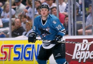
Without a doubt, the worst Sharks jersey in franchise history was their 2007-2013 era sweaters. Coinciding with the new Reebok Edge jerseys, this 3rd style generation for the Sharks jersey was too complicated. The many changes included a new Sharks logo and yet another new shade of teal that took on a greenish hue. This new color was exaggerated and accented by the addition of orange to the Sharks color palette. Fan reaction and sales may have provoked the Sharks to make a change. This jersey served the shortest tenure, going only 6 seasons, between 2007-2013.
Personally, I was so put off by the sheer number of changes… the teal color change, the addition of orange, the shoulder yokes, and adding numbers to the front… that I wouldn’t buy it. I also wasn’t much of a fan to the updated Sharks logo although I’ve slowly warmed to it. While I have 2 of these jerseys in my closet, both were given to me and I’ve never worn them. I even have jerseys for Dan Boyle and Brent Burns in the 2nd generation style because I love those players but didn’t like these jerseys.
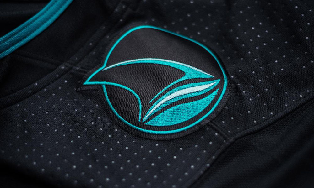
2018-Present Black Alternate (Stealth)
Joe Thornton
I like the creativity of using a circuit board pattern on the sleeve striping. I love the return of the circle fin logo to the shoulders. However, the Sharks had done 2 black alternates previously. I thought this was the time do something different, perhaps radically so, for an alternate.
With the addition of the crew neck that was added the previous season during the transition from Reebok to Adidas, why not use a different crest rather than altering the current one?
Perhaps the Sharks could’ve used the SJ logo that is currently in use as a shoulder patch on their current white jerseys. What about using the screaming shark logo currently used as the shoulder patch on their teal sweaters? How about exchanging the logos they did use and feature the circle fin as the crest with the altered primary logo on the shoulders? Again, I like this jersey, but I think it missed the mark on standing apart.
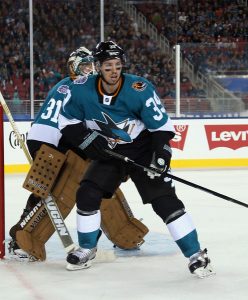
2008-2017 Black Alternate
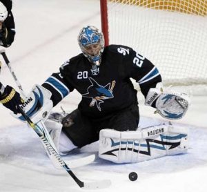
Evgeni Nabokov
This second black alternate of the franchise was the first Sharks jersey to feature a different crest. Aside from using the full shark body design, it was also the first to include draw strings.
This jersey obviously inspired the design of the current jersey as it also only features striping on the arms with no waist stripe. Fans will also remember a run of playoff games in these jerseys. Players admitted to liking them more because they were lighter weight than the 07-13 era Reebok Edge jerseys.
While this was a very popular jersey, I believe most of the sales were driven largely because fans failed to respond well to the Reebok Edge sweaters released in 2007.
2014-2015 Stadium Series
Logan Couture
 Upon release, I was not a fan of this sweater, but it’s grown on me over the years. I absolutely love the Northern California patch. In fact, I’d like to see the Sharks use that again in some fashion. The 30th anniversary would appear to be a good time to do so if they’re inclined. I’ve also come to like the oversized numbers and the carbon fiber logo.
This was the first Sharks jersey to feature a crew neck. For whatever reason, I still haven’t warmed up to it yet. There’s just something about the previous neck lines over the years that became synonymous with hockey.
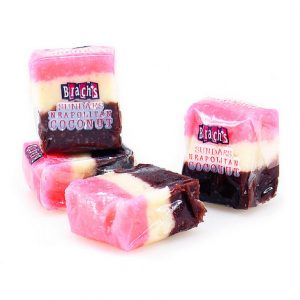
Even though five years have passed since the debut, I’m still reminded of Brach’s candy whenever I see this sweater from the Stadium Series against the Los Angeles Kings at Levi’s Stadium.
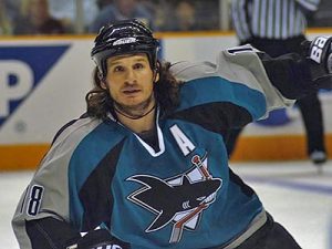
2001-2007 Black Alternate

Jonathan Cheechoo
This jersey might be too minimalist for some, but the striping on the sleeves and arched nameplate really pop. It also marked the return of the circle fin patch on the shoulders which had been jettisoned when the Sharks debuted their first alternate jersey in the 1997-1998 season which then became their primary jersey the following season.
There is just something about this jersey that does it for me. Perhaps it’s because it’s the first black jersey the Sharks ever had. Maybe it’s the Chevron striping on the sleeves. It could be the unique neck line. Whatever it is, you have to admit the original Sharks crest looks pretty sick with this design. The original logo just stands out so much better on a black jersey rather than the current logo.
As much as I like the jersey, it falls down the list simply because it’s black. I root for team teal, not team black. I’m part of TealTownUSA, not BlackTownUSA. As Rocket Backhander says, “Teal Shoes, Teal Booze, Teal Hair, Don’t Care”. It’s all about the teal.
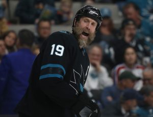
2013-Present
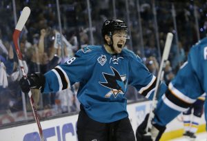
Tomas Hertl
While the jersey could still use a waist stripe similar to the 1998-2007 jerseys, it’s a solid design and was clearly inspired by the 2nd black alternate. It has a clean look which only got cleaner after removing the number on front in favor of a 25th anniversary patch during the 2015-2016 season.
However, the Sharks probably should’ve lost the draw strings at the neck during the transition from the Reebok Next Wave jerseys to the new Adidas crew neck design. They simply appear functionless and out of place in the Adidas style. Sportslogos.net lists the Adidas version of the current jersey as a separate version. For me though, it’s too close to the Reebok one it replaced for me to consider it as a new sweater.
1998-2007
Mike Ricci
What began as the first alternate jersey in Sharks history during the 97-98 season became so popular, it became the primary jersey for the team the following season and would last for 10 seasons.
This jersey still holds the record for longest tenure and for good reason. For me, this design was flawless. The new font used for the nameplate and numbers are unique and look fantastic. However, I remember some announcers having difficulty reading them from high up in the press box.
When this jersey was released, it was completely different from anything else in the league. It featured arched lines, nameplates and a new neckline design that oozed cool. Most fans, myself included, would like to see an Adidas version of the first ever Sharks jersey. However, I’d love to see the Sharks return to using this design at some point. If the Sharks ever decide to retire the numbers of Ricci, Nolan, or Nabokov, this is the jersey it should be done in.
1991-1997
Jeff Friesen
Ah, you never forget your first. The Sharks hit it out of the park with their first jersey, nailing the color, design, and logo. This jersey sold in record numbers and even appealed to people who had no idea what the NHL was, much less who the Sharks were. The logo was even seen in The Mighty Ducks movie. There are also photos all over the internet of several different celebrities rocking this style.
While the Sharks never played in them during their 20th anniversary season, teal replicas were available for sale at the Sharks Store at SAP during that time. Of course, we all remember the 25th anniversary season when the Sharks brought these back and played a handful of games in them. Obviously, time marches on and change happens, but any team will be hard pressed to top this jersey. Everything about this jersey is perfection.
During the 90’s and going into the 2000’s, the San Francisco 49ers tried a lot of different changes to their jerseys and made subtle tweaks to some of their logo marks. After all the experimentation though, they returned to their classic design that had worked for decades. Perhaps it’s time for the Sharks to take a page from the 49er playbook and return to their classic and best jersey in the NHL.
Where do you rank the Sharks jerseys? Leave it in the comments below.
But what about other teams?
For those of you who like to see jerseys other than the Sharks, check out our draft of the 10 best and worst NHL jerseys. You won’t believe #3! 😉

7 Comments
Leave a Reply
Leave a Reply


News and Editorial
2026 San Jose Sharks Draft Recap – 6/28/2026 – Teal Town USA


Steve Cropper
July 23, 2019 at 12:33 pm
Worst to first–Stadium Series(Don’t like it and we lost-do not need to be remnded of loss), 01-07 Black Alternate(too bland), Steath(Bland), 91-97 do not like lower stripe/white, 07/13, 08/17, 98/07 and my favorite is current teal. I love the article though and the explanations of the genererations of jerseys. Great job!
AJ Strong
July 23, 2019 at 1:54 pm
Nice list. Thanks for the feedback.
Grant
August 11, 2019 at 7:45 pm
I think the 2013-17 and The Adidas should be separate because of the different shoulder logos on each.
AJ Strong
August 12, 2019 at 3:31 pm
While the neckline and patches are different between Reebok Next Wave and the current Adidas, the overall design isn’t different enough for me to consider it a separate style.
Rick Gray
August 16, 2019 at 12:06 pm
Thanks for the Article, I like it and agree that a 30th anniversary should be made. I see the boys skate with different types of Jersey’s all the time in warm ups. There was one I really liked last season. It was gray, with A white name patch with easy to see letters and then the Screaming Shark logo on the front teal accent piping was down the sides. Some of the elements reminded me of the Flyers jerseys.
AJ Strong
August 16, 2019 at 12:21 pm
This one? Sharks Instagram
Jaime
January 6, 2020 at 7:39 pm
1991-1997 TEAL JERSEY THE BEST!!! One of the coolest jerseys from NHL after the Ducks in eggplant color.