After nearly a week of manufacturing hype, Adidas and the NHL finally revealed the Reverse Retro jerseys. Despite the build-up, this league-wide 4th jersey wasn’t much of secret as we wrote about it last January. We also hinted about it prior to that article, but they’ve finally been released.
Essentially, the reverse retro jerseys are “throwbacks with a twist”. The primary idea is to take a jersey from a team’s past and change it up slightly with an inverted color scheme and possibly other notable tweaks. As you can see from the Adidas video, each jersey represents a year or era from that particular team. Of course Vegas is the notable exception and are using the Las Vegas Thunder as their inspiration.
#ReverseRetro Coming Soon. pic.twitter.com/DknyOald0h
— adidas Hockey (@adidashockey) November 10, 2020
Adidas and the NHL had a lot of options. But as with seemingly everything, there must be winners and losers. Some teams took the opportunity to come up with something spectacular while other teams seemingly spent all of 10 seconds with their designs. Here’s the list for who killed it, who blew it, and who is simply unremarkable.
Winning
Anaheim Ducks, Arizona Coyotes, Buffalo Sabres,
Carolina Hurricanes, Colorado Avalanche, Dallas Stars,
Los Angeles Kings, Minnesota Wild, New York Rangers, Winnipeg Jets
These jerseys are the chef’s kiss, must-haves of the lot. You’ve got the return of the “it’s so damn ugly, it’s cool” Wild Wing Ducks jersey. Arizona has the peyote Coyote in a gorgeous purple while the Kings finally bring the same color back into their boring, monochromatic palette. The Stars and Sabres bring back solid selections that have long been fan favorites.
The Avalanche, Hurricanes, Wild and Jets get high marks for throwing back to their historic roots of the Quebec Nordiques, Hartford Whalers, Minnesota North Stars, and original Winnipeg Jets, prior to their relocation to the desert. Of course, the most notable for me is long awaited return of the Rangers’ Lady Liberty crest.
AVAILABLE NOW: https://t.co/ftRh3LsMbG pic.twitter.com/HH6ti3kE4f
— Colorado Avalanche (@Avalanche) November 16, 2020
Fly in formation. Introducing the @anaheimducks adidas #ReverseRetro jersey. Hitting the ice in 2021. pic.twitter.com/w3jC7AqoEi
— Anaheim Ducks (@AnaheimDucks) November 16, 2020
While these jerseys will be used sparingly in games, Adidas and NHL will be laughing all the way to the bank from the sales of these beauts.
Losers
Boston Bruins, Calgary Flames, Detroit Red Wings, Edmonton Oilers,
Montreal Canadiens, Nashville Predators, Philadelphia Flyers, Pittsburgh Penguins,
St Louis Blues, Tampa Bay Lightning, Toronto Maple Leafs
Wow, this is the best you could come up with? Why is it that teams with such storied histories like Boston, Detroit, Edmonton, Montreal, Philadelphia, Pittsburgh, and Toronto are so damn boring? Each of these designs are just downright bland and boring. Maybe I’ll reconsider the Blues jersey later on, but the rest of these do nothing to stand out.
#ReverseRetro x #LGRW pic.twitter.com/jEUDjqbSsP
— Detroit Red Wings (@DetroitRedWings) November 16, 2020
Your Colors. Your Retros. Remixed. #NHLBruins fans can purchase the adidas #ReverseRetro as part of special pre-sale tonight at 6 p.m.
Full Details ➡️ https://t.co/2Rc78pZins pic.twitter.com/aCQfvCFI1w
— Boston Bruins (@NHLBruins) November 16, 2020
Meh ¯\_(ツ)_/¯
Chicago Blackhawks, Columbus Blue Jackets, Florida Panthers,
New Jersey Devils, New York Islanders, Ottawa Senators, San Jose Sharks,
Vancouver Canucks, Vegas Golden Knights, Washington Capitals
This group was predictable and uninspired. They aren’t awful, but they don’t wow. As the meme says, I’m’ not mad, I’m just disappointed.
Obviously Vegas has no franchise history to celebrate so they went with the history of hockey in Vegas and gave a nod to the Las Vegas Thunder. As for the others, they’re basic color inversions. If you liked that style previously, you’ll enjoy these, but you may not be clamoring to be the first on your block to have one.
https://twitter.com/SanJoseSharks/status/1328359386104795136?s=20
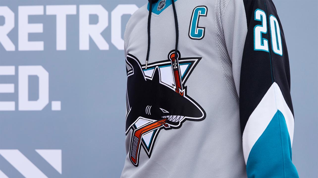
You’ll notice I have the Sharks listed in this group. First, I’ve been aware of this design for a while. Unfortunately, I think this Sharks jersey is a victim of timing. Had this league-wide 4th jersey program not happened as the Sharks are coming into their 30th anniversary, I think the Sharks likely go with a reverse retro jersey of their first design.
The 25th anniversary heritage jersey sold insanely well. How do you not go with a grey or black version of the first jersey and throw it back to 1994? Who doesn’t remember an upstart Sharks team knocking out Stanley Cup faves, the Detroit Red Wings, while playing their first season on San Jose? The only reason not to go with the inaugural Sharks jersey is because you already have something in the pipeline.
With the Sharks likely releasing a 30th anniversary heritage jersey, it makes sense to throwback to the first ever alternate jersey in franchise history from the era of Owen Nolan, Mike Ricci, and Evgeni Nabokov. It should be noted that the Sharks reverse retro design is not based entirely on the first alternate Sharks jersey, but actually on the white counterpart that came out the following season. If we’ve learned anything though, it’s that Adidas and the NHL likes releasing jerseys. If your favorite isn’t available right now, it might be soon enough.


