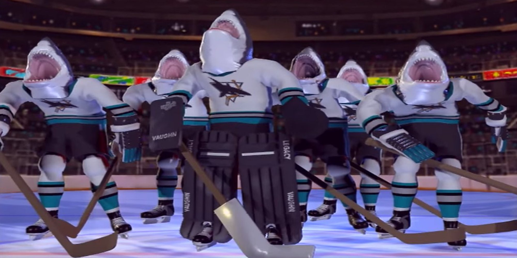
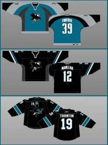
 There’s an old saying, “nobody likes change”. Evidently, the Sharks have never heard this saying. For the first six years of the franchise, the Sharks had the same logo and crest on their jerseys (or sweater, if you prefer) and for much of that time, the Sharks led the league in sales due to the enormous popularity of the logo and teal color.
During their 1997-1998 campaign, the Sharks introduced a third, alternate jersey in a slightly darker teal. Following that season, that alternate sweater became their new primary jersey. While I loved their inaugural jerseys, I thought their “2nd generation” jersey was a huge upgrade. No other team in the league had ever worn a jersey like it and it really stood out from the league.
For 10 seasons, the Sharks would continue to wear their 2nd generation jerseys, although they did introduce a 3rd alternate in black in 2001. Of course, during the late 90’s and early 2000’s, nearly every team in every sport released a black alternate to goose their sales.
Livin’ on The Edge
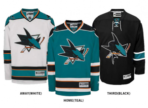 In 2007, a league wide deal was inked with Reebok to be the exclusive jersey manufacturer for the NHL. Due to the new “Edge” design, several teams took this opportunity to revamp their jerseys. The Sharks took it a huge step further by not only releasing a new generation jersey, but also unveiled a new crest and secondary logos.
When these new jerseys were released, I hated them. In fact, I still do. I personally own at least one of every jersey the Sharks have ever released with the exception of the 3rd generation. While I’ve grown accustomed to the new logo, I was absolutely put off by the addition of orange. Also, the 3rd generations always look more green than teal to me. A lot of fans must have agreed with me since the 3rd generations had the shortest tenure, lasting only 5 seasons.
Circle Fin
Along with the new crest and jersey, a new secondary logo replaced the hugely popular “circle-fin” with a new diamond logo. Over the first 15 years of the franchise’s history, the “circle-fin” appeared on almost as much Sharks merchandise as the actual team crest. I still own a sweatshirt and several caps that prominently feature the “circle-fin”.

Diamond Fin
The diamond replacement has been featured on almost nothing which makes me wonder why they introduced it at all. Obviously, the reasons you make any of these changes is money. Just about any team can slap a new logo on a shirt or hat and boost their sales. However, this new secondary logo was featured heavily during the launch so I’m still surprised it wasn’t used more prominently.
New Secondary
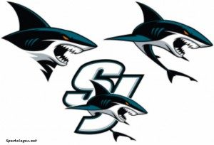
Today, the Sharks introduced their new secondary logos. While I actually like these new logos, I find myself asking more questions:
- Will this new logo actually get used rather than ignored like the diamond fin was?
- Why not use the current full Sharks graphic with the “SJ” instead of a new logo?
- Will these logos eventually replace the current Sharks logos?
- Is a new alternate jersey in the pipeline?
The Sharks just completed their 25th season. Over that time, fans have seen 4 different jerseys, 2 different logos, and 3 different secondary logos. That’s a lot of changes for a relatively young franchise. At least these new logos and current jersey have one fantastic thing in common. Almost no orange.




Pingback: The next San Jose Sharks alternate jersey - Teal Town USA