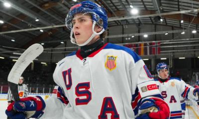
Since the transition from Reebok to Adidas as the league-wide NHL jersey manufacturer, warm-up jerseys have reached a new level of cool. Whether you see it’s a nod to the old school design or an acknowledgement of the new, like the Sharks freak layout, warm-up jerseys have become a massive hit among fans.
San Jose Sharks warm-up jerseys
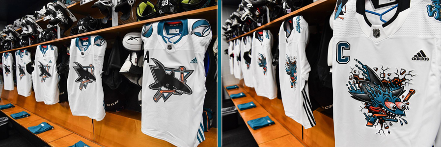
That said, I must confess I’m a much bigger fan of the jersey on the left in the example above. That’s not due to the utilization of the old logo, but rather the use of actual embroidered patches. With the Sharks freak design on the right, the crest and shoulders are essentially printed rather than embroidered. While that allows for more intricate designs, I still prefer true embroidery.
Old Style, New Warm-Up
The Anaheim Ducks took particular advantage of putting out some fantastic warm-up jerseys during the 2018-2019 NHL season for their 25th anniversary. Between the inception of the Ducks franchise and today, Anaheim has skated in 11 different jerseys. In an effort to mark that accomplishment, during their silver anniversary, the Ducks skated in warm-up jerseys throughout their season that were variations on their history of jerseys. It made me wonder… what if the Sharks followed suit for their upcoming 30th anniversary?
Now, before we move one, let me make one thing clear. The images below are not meant to be exact representations of past San Jose Sharks jerseys. Previous Sharks jerseys were simply used as starting point of reference and inspiration.
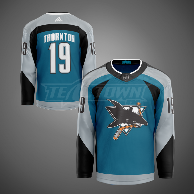
Inaugural – Home
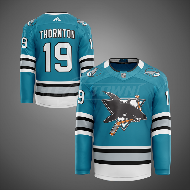
We obviously begin with the first jersey the Sharks ever wore as our baseline. Most Sharks fans are familiar with the “heritage” jerseys San Jose played in and sold during the 2015-2016 season, marking their silver anniversary. While the jerseys were gorgeous, they didn’t implement the original Sharks teal from 1991. What would a Sharks jersey from 1991 look like today if it was designed by Adidas? Whether used as a one-time warm-up or used throughout the entire season, this Adidas reimagining of the very first Sharks jersey looks incredibly clean. I might prefer this style over my actual authentic jersey I bought at the San Jose Sharks store in Vallco nearly 30 years ago.
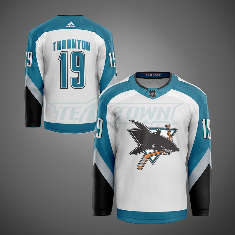
Inaugural – Road
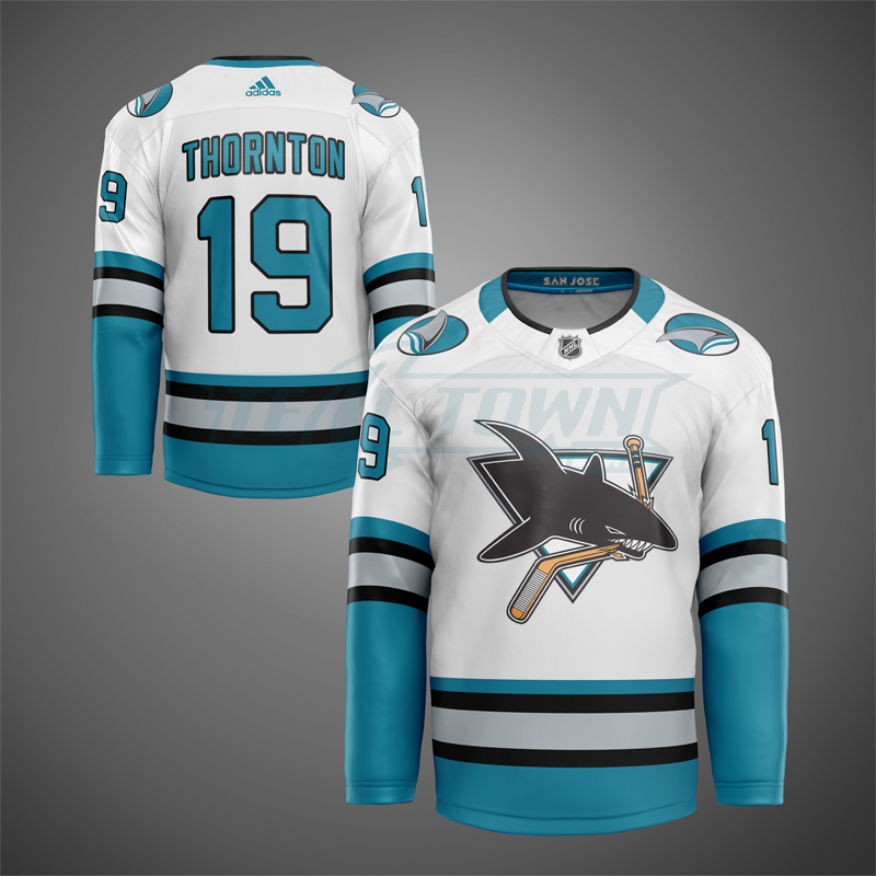
For some unexplained reason, Adidas doesn’t produce white jerseys for sale to fans, but they’ve produced several white warm-up jerseys. While Fanatics does make white replicas, the selection is limited. Also, Fanatics has a history of manufacturing substandard merchandise.
I absolutely love the SAN JOSE wordmark inside the collar. We’ve even slightly increased the size of the shoulder patches, similar to the warm-up jersey featured in the top image. I don’t know if it’s the use of the original teal or just seeing the old school logos, but these reimaginings have my wallet happy they don’t actually exist. For now.
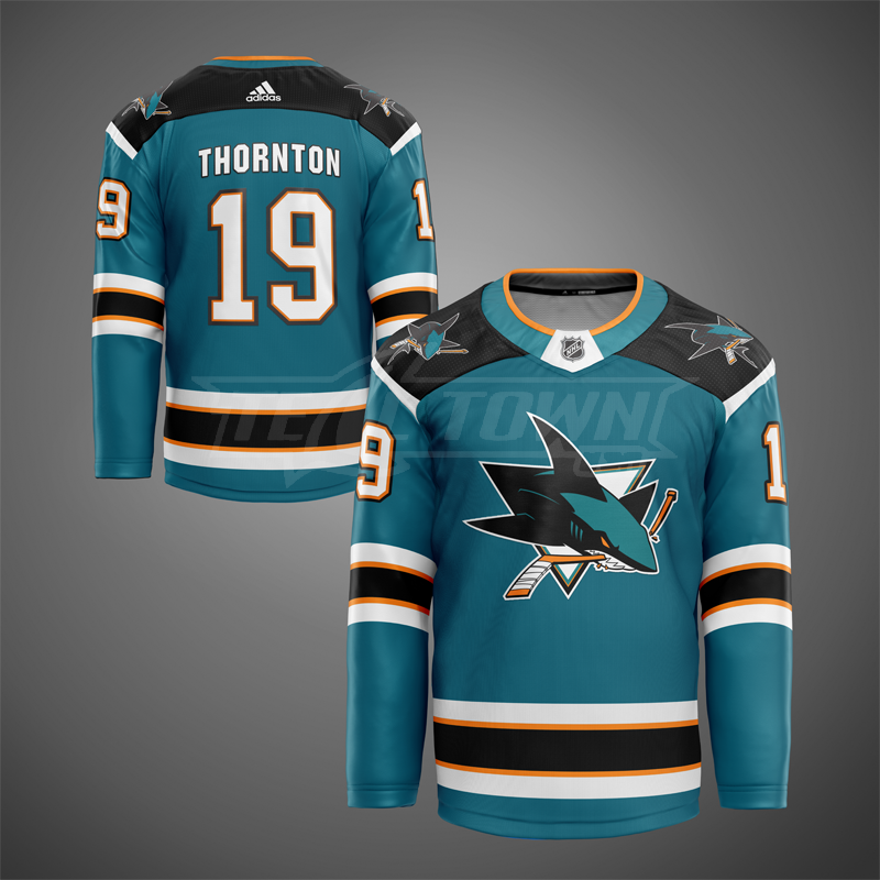
1998 – Home
This time, we focus on the 2nd generation of San Jose jerseys the Sharks wore between from 1998 through 2007. However, some may say 1997 since this design is based on the first ever alternate jersey in San Jose Sharks history. Once again, these images are not meant to be exact representations of past San Jose Sharks jerseys.
1998 – Road
While a solid majority of fans point to the first Sharks jersey as the best one, I’ve always been partial to this one. The arched nameplate and futuristic number font always caught my eye. I also like how grey is more of a feature than an accent with this era of Sharks jersey, particularly on the home jersey.
We really didn’t change anything from the original design aside from updating the collar to the Adidas style. This design is also stands out as the only one to not feature patches on the shoulders.
2007 – Home
I was never a fan of this jersey when it came out. For me, it was too much change at once with the update to the logo and the addition of orange to the color pallete. It also seemed to be a tad busy so we kept that idea when putting these mock-ups together. We did remove the numbers on the front because no jersey should have those.
1998 – Away
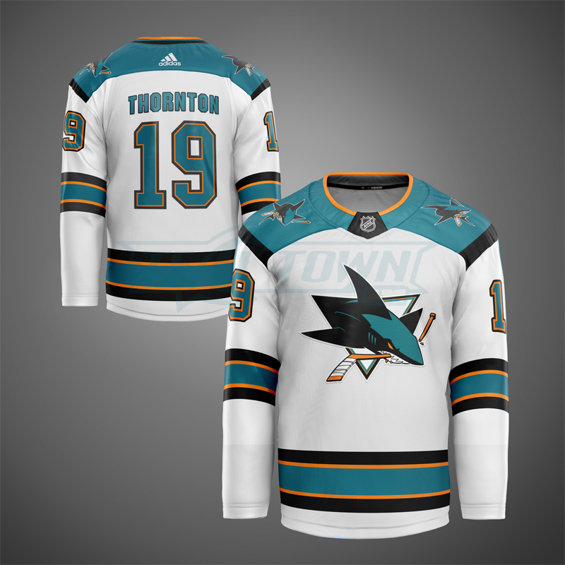
This is the only Sharks jersey where I think the white version is better looking than the teal. While it does have a classier look, I will still never be a fan of this design. Since it had the shortest tenure as a Sharks jersey, I’m obviously not the only one to feel this way.
Rumors
Since being rumored about in January, there has been rampant reporting and speculation that all 31 NHL teams will be getting a specialized retro jersey for next season. I don’t know about you, but I would love seeing the Sharks playing games in the reimagined inaugural or 2nd generation jerseys above. Would Sharks fans mind going back to this look for the entire 2020-2021 season? Or beyond?
Check out part 2 for our focus on alternate jerseys.

3 Comments
Leave a Reply


Pucknologists Podcast
Season Wrap-Up, Who Stays And Goes, Playoff Brackets – The Pucknologists 218


Pucknologists Podcast
Cooley High, Last Place Locked, Utah Yotes, NHL Playoffs – The Pucknologists 217


Pucknologists Podcast
Eklund Hat Trick, Graf Signs, Biggest Sharks Offseason Ever? – The Pucknologists 216


AMCMA
April 10, 2020 at 3:16 pm
Typo for the 2007 Aways.
I also hate the 2007 away jerseys. Both the originals and these.
Pingback: Sharks 30th Anniversary Warm-Up Jerseys - part 3 of 3 - Teal Town USA
Pingback: Sharks 30th Anniversary Warm-Up Jerseys - part 2 of 3 - Teal Town USA